Working alongside some of Australia's top companies
As a Senior UI/UX Designer and Team Leader I applied my knowledge and industry experience to design sites for a wide range of clients across a variety of industries across Australia, New Zealand, Pacific, Europe and the United States.
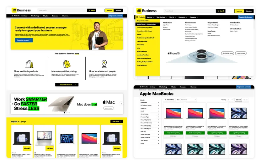

JB Hi-Fi
Technology, Business & EducationCollaborating closely with Green Hat, I played an integral role in the conceptualisation and implementation of a revitalised ecommerce platform for JB Hi-Fi Solutions, specifically tailored for the Business & Education sectors. This project involved a comprehensive redesign, encompassing user interface enhancements, user experience optimisations, and the seamless integration of innovative features to elevate the overall digital experience.
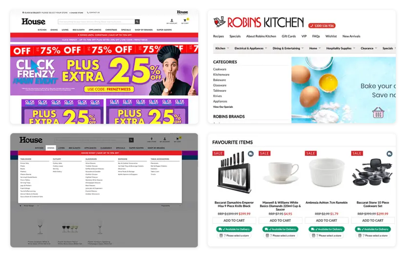


House & Robins Kitchen
Homewares & LivingEngaged in the intricate design and front-end development phases, I actively contributed to the House & Robins Kitchen ecommerce sites for Global Retail Brands Australia. Employing strategic enhancements to the CV ecommerce framework, my focus was on transforming the existing designs into a contemporary, revitalised aesthetic.
Beyond coding, I collaborated closely with both marketing and IT teams, ensuring that the site not only met technical requirements but also aligned seamlessly with marketing goals. This collaborative effort aimed to mold and shape the ecommerce platforms into successful, user-centric projects that resonate with both brand identity and market expectations.
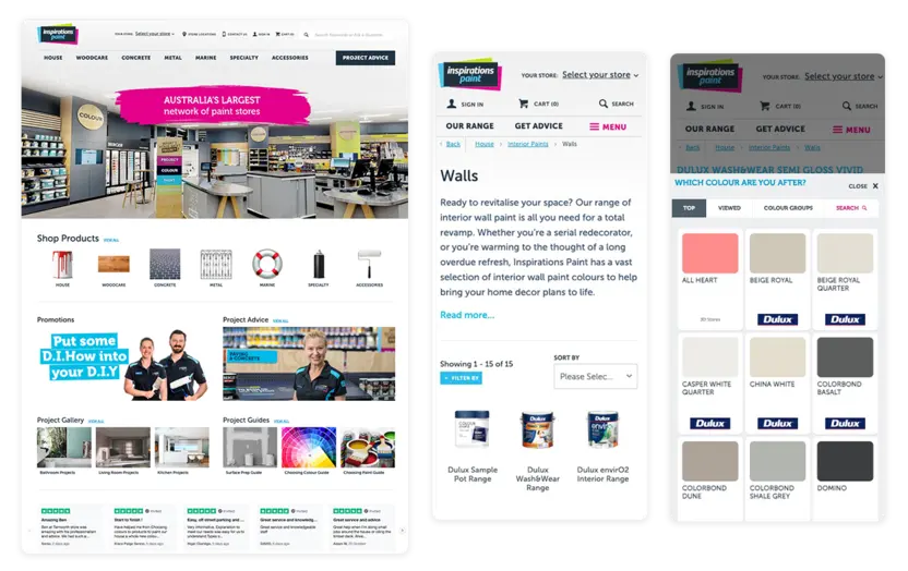

Inspirations Paint
Paint, Trade & DIYI offered comprehensive guidance to our external partner, (Village of the Useful), throughout the project aimed at crafting and refining the front-end user experience for Inspirations Paint. Given the highly customised nature of the design, my role extended beyond conventional consulting to ensure an exceptional outcome.
Navigating intricate design requirements, one of the pivotal features involved developing a bespoke colour swatch picker tailored specifically for paint colouring—a functionality that demanded meticulous attention to detail and close collaboration with both the design and development teams. This ensured a seamless integration of a key feature that enhanced the overall user experience of the platform.
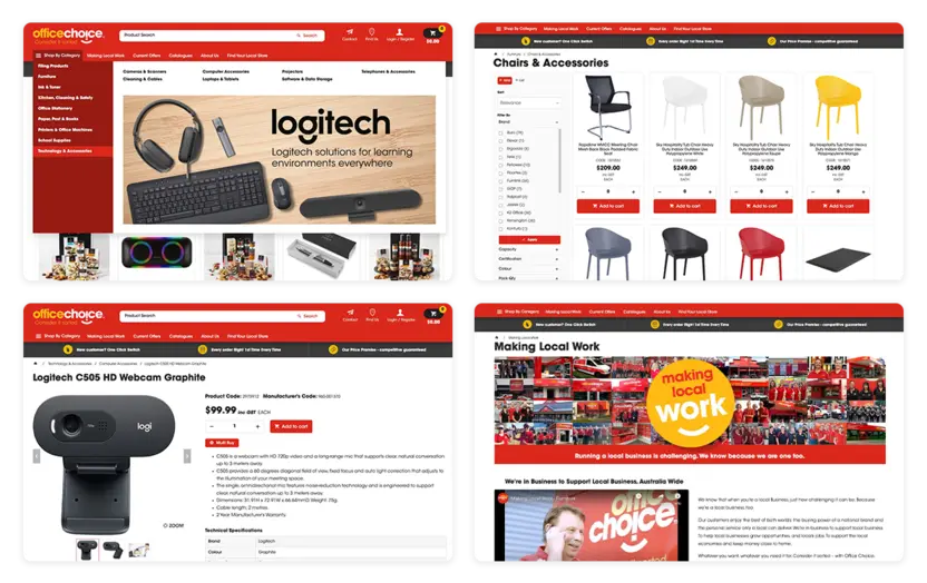

Office Choice
Technology, Business & Office SuppliesFor the Office Choice group of sites, a central theme was meticulously crafted and implemented, destined for deployment across all Office Choice member sites. This ambitious undertaking demanded swift execution without compromising on design excellence.
The core challenge lay in fostering a modular design framework that allowed for seamless customisation on each member site, ensuring flexibility without sacrificing the uniformity and coherence of the central theme. This required a meticulous approach to design and development, empowering each member site to personalise their online presence while maintaining the overarching visual identity and functionality of the collective platform.
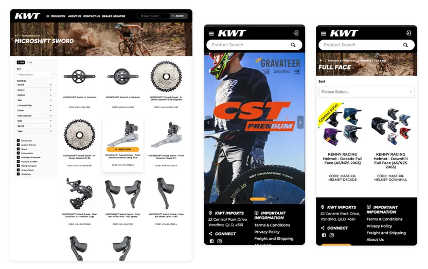

KWT Imports
Bicycle wholesalerI crafted a tailor-made design solution for KWT Imports, a prominent local authority in biking equipment and parts. The challenge was to curate a sleek and sophisticated black-and-white design aesthetic that served as an elegant backdrop, effectively accentuating the high-quality action photography showcasing biking products.
The focus was on achieving a seamless visual harmony, allowing the striking product imagery to take centre stage while ensuring that the design elements complemented and elevated the overall user experience. This involved a meticulous balance between minimalistic design principles and the bold, dynamic nature of the showcased biking equipment.
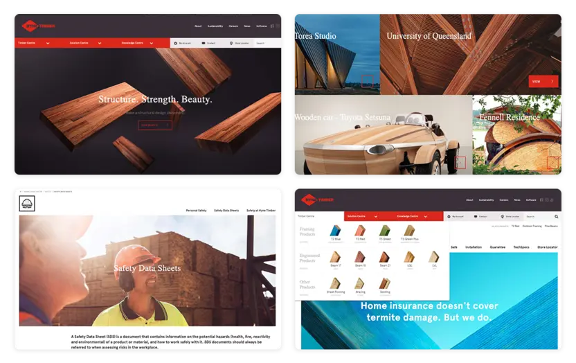

Hyne Timber
Manufacturing & TradeHYNE Timber had a strong brand identity crafted by Big Fish, my task revolved around translating their brand into their web and digital presence. The ultimate goal was to strike a delicate equilibrium between design and functionality.
This involved a multifaceted approach, I crafted a UI/UX design that encapsulated the essence of the brand, but I also integrated crucial product information. Additionally, I spearheaded the creation of custom-designed ordering functionalities tailored specifically for their trade customers.


Superior Food Services
FoodserviceFor Superior Food Services, I created a design tailor-made for the food industry. Understanding the pivotal role of chefs and food industry workers in the ordering experience, the focus extended beyond aesthetics.
The design revolved around facilitating an efficient and intuitive ordering process. This involved designing features like pantry lists and repeat ordering functionalities to streamline workflows.
Empowering the end-user chefs and industry professionals with an interface that not only catered to their specific needs but also enhanced their overall experience.
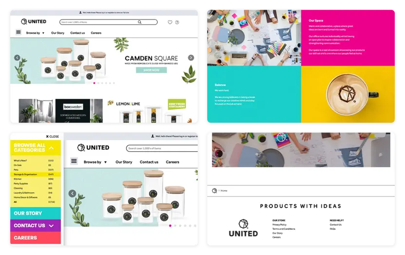

United Wholesalers
Wholesale homewares and pet suppliesCollaborating closely with the United Wholesalers' marketing team, the emphasis was on creating a vibrant and compelling online presence that resonated with their core values.
To achieve this, the design strategy involved incorporating bold colour contrasts that mirrored the brands vivacity and energy. Integration of mobile functionality into the desktop experience was a pivotal step, aligning with the client's key values of adaptability and accessibility to create a unified user experience across devices.
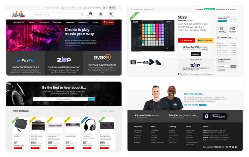

Store DJ
Music & PerformanceCollaborating closely with the ecommerce and graphic design team, the goal was to craft a foundational site design that resonated with the dynamic essence of the music and performance industry.
The focus was on infusing the website design with modernity and dynamism, aligning it with the fast-paced and expressive world of music.
Focusing on useability and customer experience, the overall design has contributed to the increased sales and the significant growth of Store DJ.
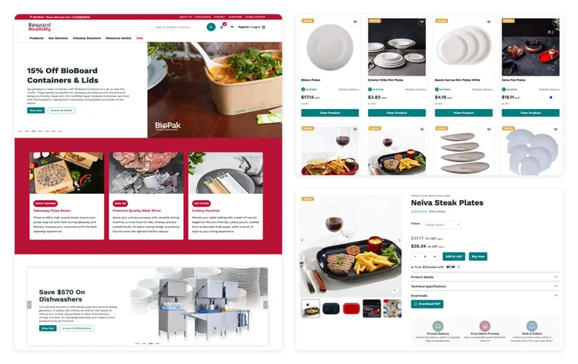

Reward Hospitality
Hospitality & HomewaresCollaborating closely with the design agency Luminary Digital, the consultation phase was pivotal, emphasising the intricate nuances of both Customer Experience (CX) and User Experience (UX) design. The goal was not only to facilitate a smooth shopping experience but also to ensure that users effortlessly accessed valuable industry-specific information.
This process resulted in an award-winning project recognised by DRIVENxDESIGN. This accolade was a testament to the successful amalgamation of functional ecommerce features with insightful food industry content, all encapsulated within a user-centric design that garnered acclaim within the industry.


RSEA Safety & Eleven Workwear
Workwear, Safety & PPEIn collaboration with RSEA and its subsidiary brand, Eleven Workwear, I took charge of conceptualising and steering the ecommerce experience for this prominent nationwide provider of safety equipment and workwear.
Throughout the process, my role extended beyond design, encompassing strategic guidance to ensure the platform aligned with industry standards and user expectations. The objective was to craft an ecommerce experience that not only promoted the product range effectively but also prioritised user convenience and safety considerations, reflecting the brands commitment to quality and reliability.
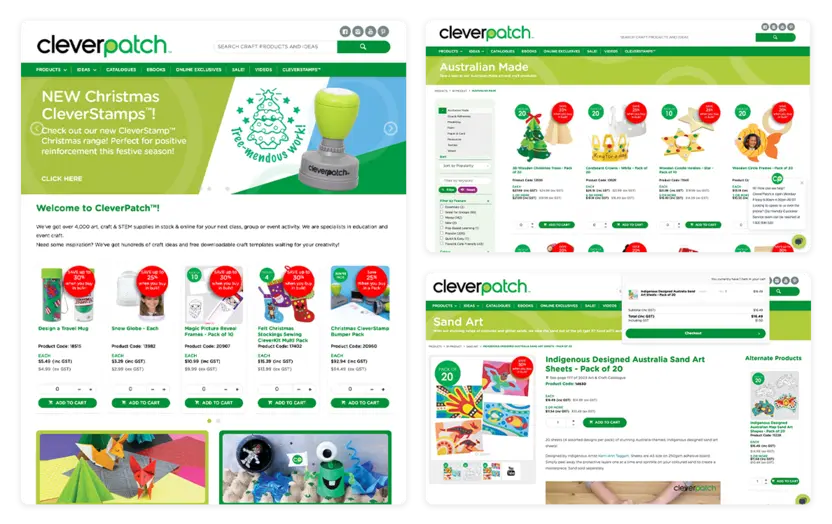

CleverPatch
Art, Craft & EducationRevamping the UI/UX design the CleverPatch ecommerce site, using design methodologies (such as modular & responsive design), the goal was to infuse the platform with a dynamic and adaptable interface that catered to evolving user needs.
The redesign prioritised a fresh and inviting aesthetic in line with CleverPatch's brand identity. Tailored specifically for their audience of art and craft educators, the design exuded a friendly and engaging vibe, ensuring a seamless and enjoyable browsing experience.
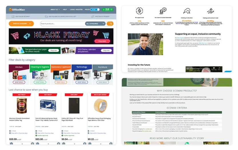

OfficeMax New Zealand
Business, Technology & Office SuppliesEngaged in the creation of a B2B ecommerce site design and framework for OfficeMax New Zealand, the primary objective was to engineer a contemporary platform characterised by its responsiveness and modular structure. The core focus revolved around crafting a cutting-edge design that seamlessly adapted to various devices.
Navigating a complex landscape of stakeholders within the organisation, my role extended beyond design implementation. I took charge of guiding the design direction, ensuring alignment with stakeholder needs and organisational objectives. The overarching aim was to create a design that not only modern and accessible, catering to the multifaceted requirements of OfficeMax NZ, setting the stage for a robust B2B ecommerce experience.
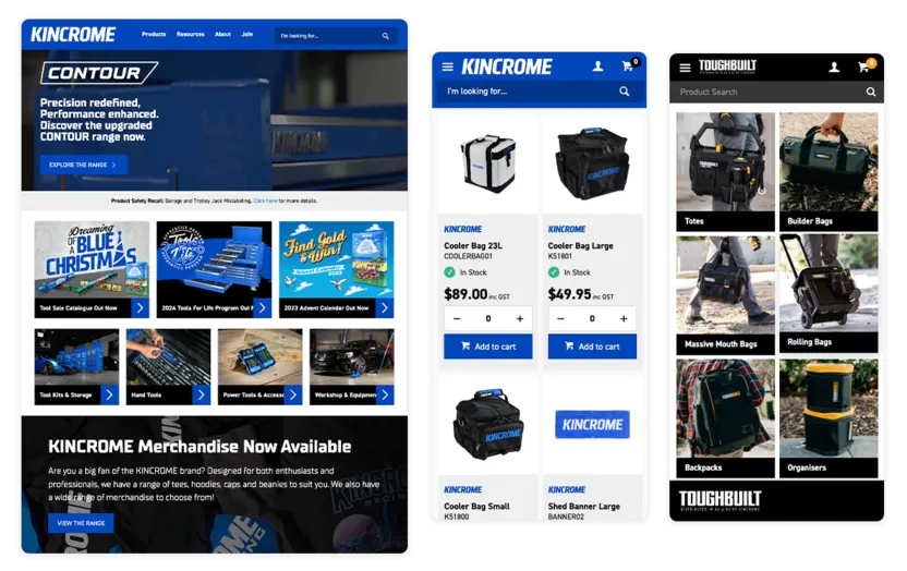


Kincrome & ToughBuilt
Tools & Trade SuppliesI provided comprehensive design direction to both the internal and external stakeholders, I played a pivotal role in steering the design direction for Kincrome. Leading the design team, I oversaw the implementation of a contemporary and rejuvenated design approach.
This involved not only providing visionary guidance but also fostering collaboration among various stakeholders to ensure a cohesive and impactful design strategy. By aligning the team's efforts with the brands vision, the end result of a modern and revitalised design that encapsulated Kincrome's ethos. The goal was to infuse freshness and innovation into the brands visual identity while adhering to industry trends and customer expectations.
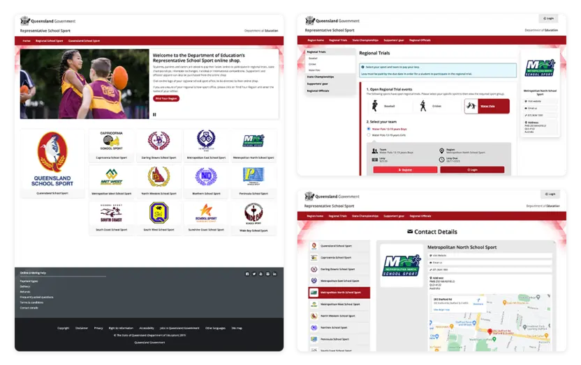

Department of Education - Representative School Sport
Education & SportingCollaborated closely with the Department of Education on a site design project aligned meticulously with Queensland Government standards.
An integral focal point of this endeavor was prioritising accessibility and ensuring strict adherence to Government guidelines. With this approach in mind, I integrating design elements that catered to diverse user needs and facilitated an inclusive browsing experience for all visitors.